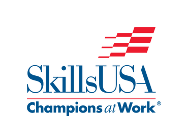
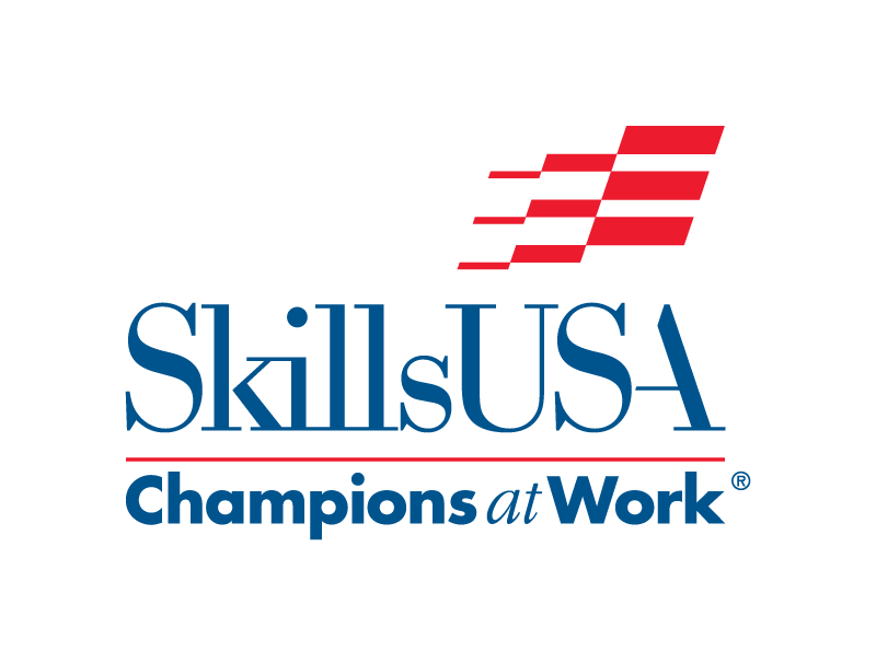
SkillsUSA Logo / Branding Guidelines
downloads
SkillsUSA Logo & Graphics Standards page:
http://skillsusa.org/about/history-brand-resources/logos-and-graphic-standards/
Download Official Logo & Slogan Art
http://skillsdev.wpengine.com/wp-content/uploads/2014/05/logos.zip
Download SkillsUSA Logo Standards
http://www.skillsusa.org/wp-content/uploads/2015/08/SkillsUSA-Graphic-Standards-15.pdf
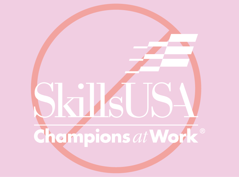
basics
|
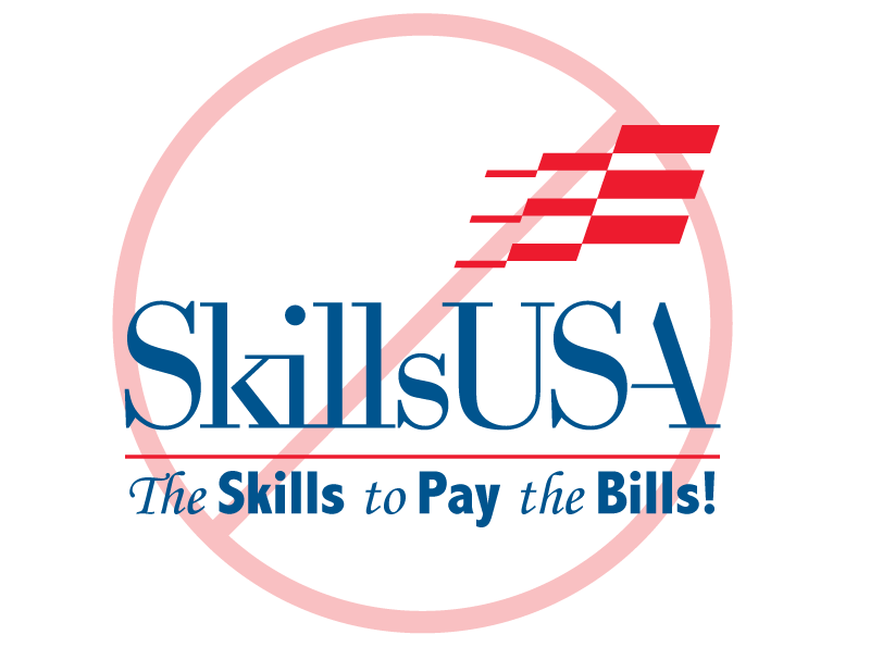
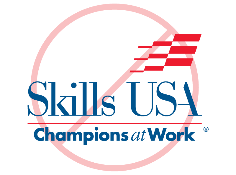
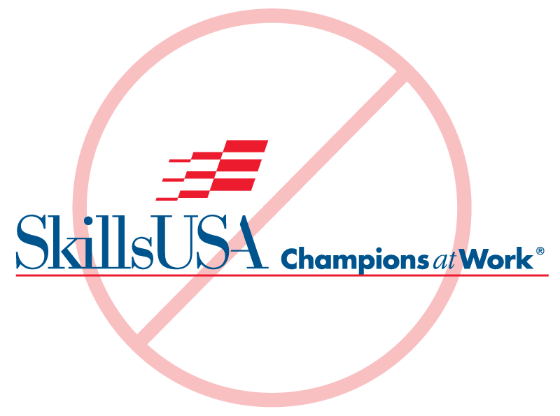
examples but not limited to:
|

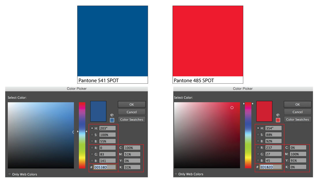
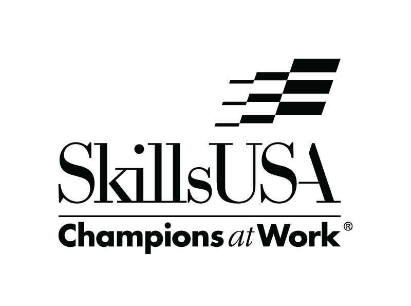
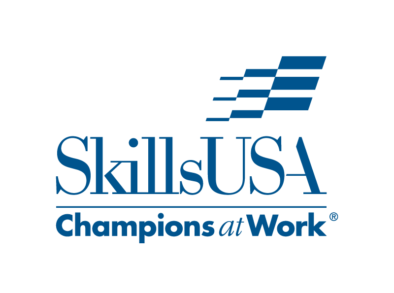
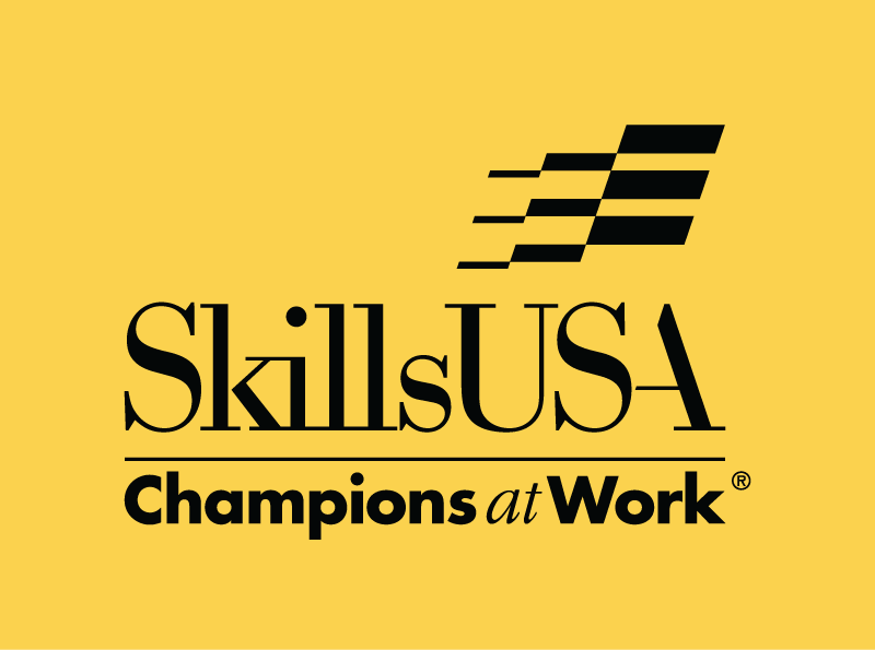
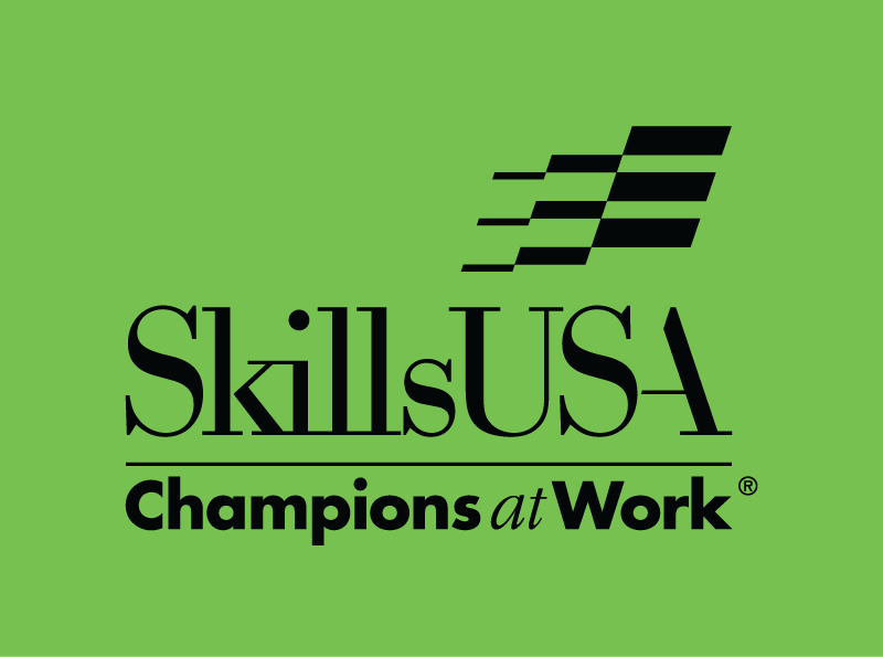
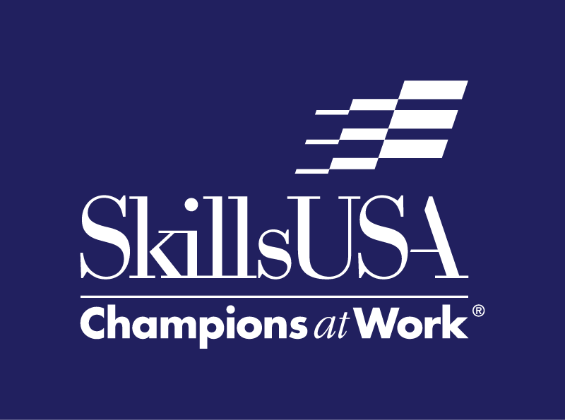
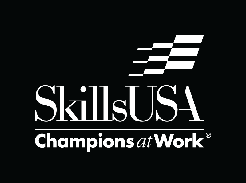
colors
|
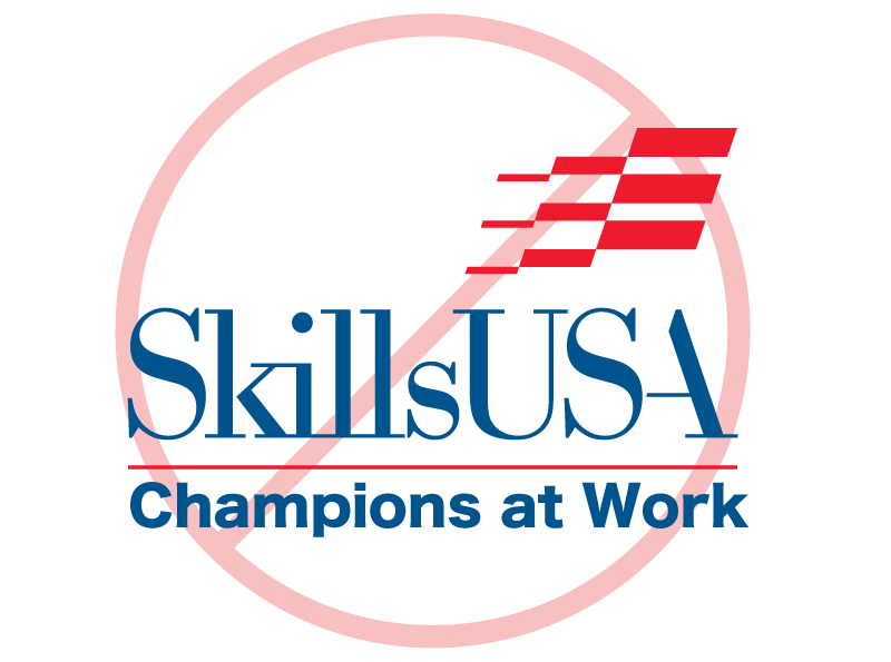
examples but not limited to:
|

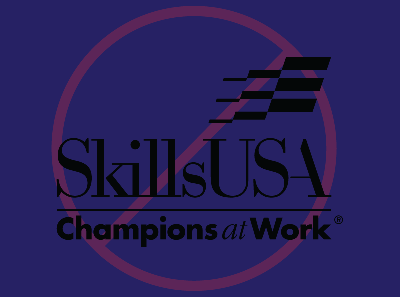

spacing
|
examples:
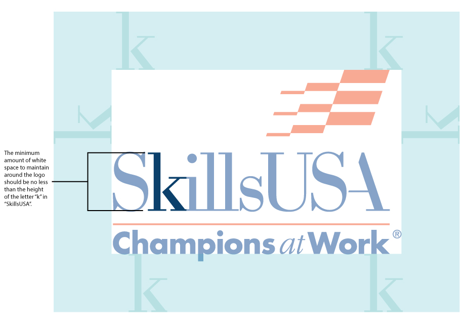
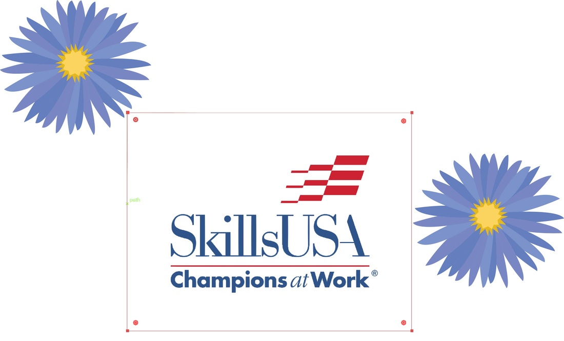
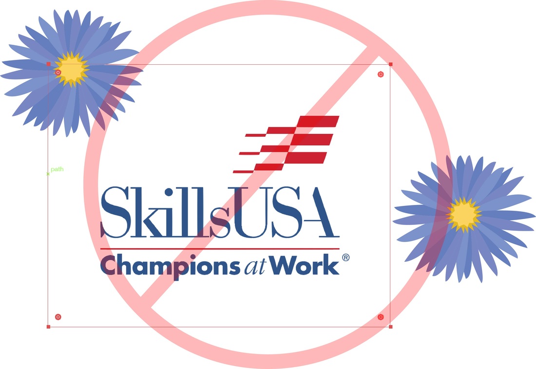
The logo has been designed to work best with plenty of empty or “white” space around it. As a rule of thumb, the minimum amount of white space in any direction around the logo should be no less than the height of the letter “k” in “SkillsUSA.” Specific examples of how to use the logo with type and other elements is provided in the section on Typography. ( click here to view - see page 12) |

fonts
The primary typeface for use with the logo is Futura.
(purchase Futura here or here or download it free from Adobe TypeKit if you have a subscription to Adobe CC)
The secondary typeface for use with SkillsUSA materials is ITC Garamond.
(purchase ITC Garamond here or here or download it free from Adobe TypeKit if you have a subscription to Adobe CC)
download and view the typography guidelines here. (see page 12)
(purchase Futura here or here or download it free from Adobe TypeKit if you have a subscription to Adobe CC)
- Its clean and simple design ensures clear communications without clashing with the logo itself, while the various weights in the Futura family provide a great deal of flexibility in designing visual communications.
- This sans serif typeface is used on all SkillsUSA stationery, and is to be used for any other situation where text is in close proximity to the logo.
The secondary typeface for use with SkillsUSA materials is ITC Garamond.
(purchase ITC Garamond here or here or download it free from Adobe TypeKit if you have a subscription to Adobe CC)
- Like Futura, it provides a wide variety of styles and weights.
- This classic serif face is very readable, well suited to setting text copy, and provides a contrast to the Futura typefaces.
- While other versions of Garamond are acceptable, the version designed by ITC (International Typeface Corp.), and available through a number of font vendors, is preferred.
- Other acceptable, though less preferred, typefaces for use on SkillsUSA materials are Helvetica, Franklin Gothic, Times Roman, and Palatino.
download and view the typography guidelines here. (see page 12)
types of files
- DO use the right type of file for the job. The EPS files are for commercial printing projects. The PNG files are for importing into Microsoft Office documents (they may appear slightly pixilated on screen but print fine).
- DO import, insert or place these graphic files according to the instructions for your software.
- DO provide the right type of color file to your vendor. “Two-color” uses red and blue inks. “Four-color,” also known as process color, creates the entire color spectrum through a mix of cyan, magenta, yellow and black.
- DON’T use any JPEGs you may find on our website in commercial printing. The resolution isn’t high enough, and the image will become pixilated if you resize it.
- DON’T try to open the EPS files unless you have an illustration program. It won’t work.
- DON’T open the files in a photo editing program. They’ll become pixilated.
size
- DO resize the EPS or PNG download to fit your particular project. These files can be enlarged or reduced without becoming pixilated.
- DO rely on SkillsUSA’s Publications Office to review your use of the art. Presenting a consistent image is essential. Also, download the Graphic Standards Manual for our logo art (Adobe Reader required).
- DON’T shrink the graphic smaller than 1/2 inch wide for printed projects. (JPEGs used online or in presentations should be no less than 1 inch wide.
